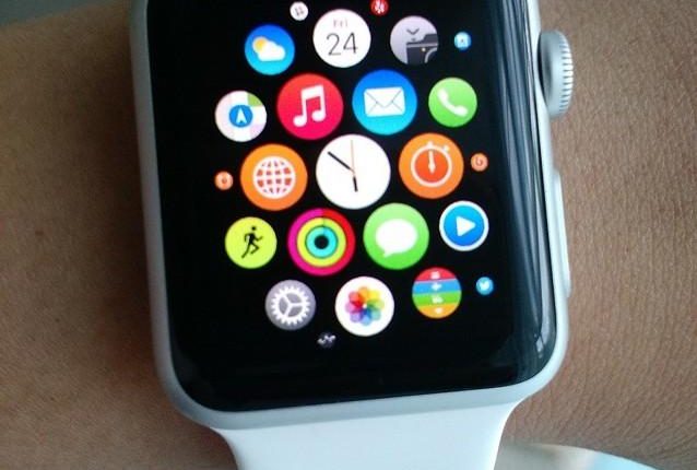
Both Apple and Samsung have created their own version of a smartwatch that link to a user’s respective smartphone. Users can send text messages, use a variety of smartwatch-enabled apps, and check their email.
While smartphones have brought users conveniences like Google at their fingertips, interactive messaging features, and social media apps on the go, smartwatches are on their way to doing the same thing. No need to pull out your phone when you can check your messages the same way you check the time.
Since their introduction to the market, Apple has sold over 13 million of their Apple watches. As these watches begin to penetrate mobile technology, let’s take a closer look at how that will impact email marketing campaigns.
Smaller interface means a shorter subject line
Email marketers should prioritize short, concise subject lines to make their content quick to read and easy to digest. Research on unique subject lines revealed that three-word subject lines have the highest engagement, but seven-word subject lines are most common.
Word choice is extremely important given you only get a few. When drafting a subject line, stay away from these trigger words that ranked low on engagement rate:
- Free, help, reminder—triggers spam filters and users often associate these emails with bombarding, repetitive messages
- Tired internet slang such as bae, fleek, ftw—rank low on open rates because they are mistaken for text messages
- FWD: and RE: lead to a sense of deceptive familiarity and are reminiscent of chain emails – too long!
Links, hashtags, and graphics could be in trouble
Subject lines accompanied by long URLs and hashtags have less than 10% engagement. URLs and hashtags also take up valuable space in an already small screen.
Email marketers should focus on a strong call-to-action in the email body. Just as the subject line, call-to-action statements should be clear, concise, and to the point.
Without optimizing your emails, images and gifs will either not load or not appear to be the right size on a smartwatch screen. Unless you’ve tested your images and are certain they will function correctly, it’s best to forgo them.
The Apple Watch doesn’t automatically download images when it is opened, so email marketers need to prepare alternative ways to engage with their readers. Include the graphics, but switch to HTML if you haven’t already to take advantage of the tag for email images.
Clean, easy to read emails
As with certain images and graphics, there are email templates that will cause issues for smartwatch users. Most email templates are designed for desktops and laptops with HTML widths of about 600 pixels.
Email templates are often too wide for most smartphones, so it goes without saying how this would taint the viewing experience on a smartphone. These inconsistencies could also prevent horizontal scrolling.
Email marketers should consider that confined space that smartwatches have and adapt their email template to a single column format or plain text. This format is easy-to-read and doesn’t require horizontal scrolling.
Think about the face of a smartwatch and the size of your index finger. If buttons and hyperlinks are too small, there’s a possibility that you could open the wrong thing. It’s not long before a user will close an email in frustration and forget what they were going to click on entirely.
With a strong call-to-action, email marketers should consider designing action buttons that are easily accessible. Buttons should be large, visible, and easy to tap on a smartwatch screen.
Email campaigns will take a little more thinking to reach smartwatch users correctly and effectively. Now that you know how smartwatches will affect your marketing display and open rates, keeping the user experience in mind is crucial.
Your customers read your emails on a variety of devices. Click here for my done-for-you system to learn more strategies about creating a successful email marketing campaign, regardless of the device.


