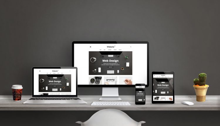
How to Make Sure Your Website Looks Great on Tablets and Phones
Many Internet marketers make the mistake of thinking that once their website is up and running, their biggest job is finished. Actually, it’s just beginning. To understand why, answer this question: How do you usually access the Internet?
If you are like most people these days, you answered, “Through my smart phone” or “From my tablet.” Because of near universal WiFi and the affordability of mobile access devices, most web users today are accessing their favorite sites and pages from their portable mobile devices rather than their laptops or desktop computers.
That means that the website you have just finished creating is essentially obsolete – at least if it’s not mobile optimized.
Critical Content Presented Concisely
Unlike PC users, mobile users don’t want to download your entire web page. It’s too much information, both for the user and for the devices themselves. Instead, they are looking for key information that they can access quickly, without having to click around to a lot of different pages.
Have you ever tried to click on a button on a smart phone? It’s difficult, if not downright impossible!
That means your website needs to have a simpler, streamlined version that mobile users can be diverted to. In other words, your content needs to be mobile-optimized.
People Are Attached to Their Mobile Devices … Literally!
Today, most people won’t leave home without their smart phone and they are using their mobile devices way more than they are using PCs and laptops – especially when it comes to searching for the products and services they want while on the go.
If your business has only a regular website, you are essentially shutting the door on the majority of customers using the Internet today.
Because mobile devices have small screens, run slower than PCs, and have teensy-tiny keypads, the mobile version of your web page needs to account for these disadvantages. Mobile optimized pages have to be easy to read, provide critical content up top and be easy to navigate without the use of the keyboard.
Advantages of Mobile Optimization
When your content is mobile optimized, you not only have access to a much larger pool of prospective customers, but you also have improved tracking thanks to built-in technologies of most mobile web page generating software.
Getting the information you need to understand how page visitors behave once they reach your mobile-optimized web pages can help you make improvements to make your pages even more effective and give you the results you want.
To learn other mobile marketinhttp://m0be.com/2490176/df14e773g techniques for increasing the value and effectiveness of your web-based business, check out our lead generation system by clicking on this link now.

