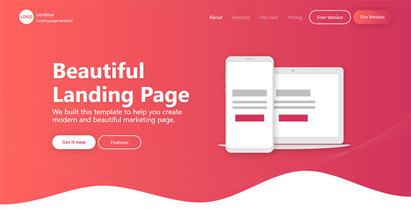
An effective landing page is one of the most useful tools in your marketing arsenal. I’ve used them successfully for many years and I always advocate their use to other people. A landing page is where all of your new web traffic is directed. It’s the main focus of your traffic generating efforts and it’s also the first thing your visitors will see.
And contrary to what you might think, the best page for new visitor is probably NOT your homepage. A good landing page will grow your opt-in list while preselling at the same time.
Creating a Webpage
The first step in creating a landing page is choosing the platform. Landing pages have been made using nearly every method imaginable. The trick is to choose one which is easy for you to use while, at the same time, making sure it works on a variety of devices and browsers.
WordPress is one of the most popular options because it is so easy to use. It has become an industry standard platform and is versatile enough for a variety of uses.
You basically purchase a domain name and web hosting, install WordPress for free, and then install a free or paid WordPress theme (site design). Other options include things like OptimizePress (a fantastic theme for squeeze pages), Drupaal, or even basic HTML if you know how to write code.
Headlines and Sub-Headlines
Search around and you’ll find that headlines are used in all of the most effective landing pages. This is the first bit of text anyone will see. It’s basically the title of your landing page and should grab the visitor’s attention. Sometimes you will only have a few seconds to capture that person’s attention, so the headline needs to be strong.
Sub-headlines can be a great addition when using a lot of text. You can think of these like chapter titles in a book except you’ll be using paragraphs instead of chapters. These are great additions because people might skip over some of the text to get to the information they want. Make these strong, too, but save the most important benefits for the main headline.
Landing Page Layout
The way you design and arrange your landing pages is important. It can be a good idea to look at a few successful examples created by other people. The headline should be right at the top, followed by a bit of sales copy and information about the offer you’re presenting under it.
Images can also help add impact to a landing page. Pictures of the product, as well as stock photos and other inspirational images, can help your visitors connect with your offer. Or, in the same place, you can have a short video that says the same thing. Or both!
At the end (or usually on the right side of the screen) is the call to action which, in this case, is an opt-in form.
Videos vs Text
For a long time, landing pages were all about text. With web based video becoming so popular, however, many marketers are utilizing this state-of-the-art technology.
Videos make presenting information incredibly simple. They require less work on behalf of your visitors and can deliver a large amount of information in a short period of time. Videos are inexpensive to produce and there are a number of ways to have one created for you.
Opt-in Box
The opt-in box is a simple form which allows visitors to submit their email address. They usually do this in exchange for a free gift. This is the main purpose of your landing page. When they fill out the form, their address is added to your opt-in mailing list. You can now keep in touch with these leads and present them with great new offers later on.
Building effective landing pages is a bit of an art, and testing to see what works is more scientific. It can be hard to figure out exactly what works over time. If you’ve tried everything and still aren’t seeing your list explode, then it’s time to discover the secret—the 4th ingredient to my master Sales Formula can instantly double your income overnight. Find out how by clicking here now.


